


👓 Signed Distance Fields for Font Rendering #
Signed Distance Fields (SDFs) have a few Game Dev uses beyond the raylib SDF fonts application we focus on here. The technique is used for Ray marching, shadow rendering and displacements, and even map rendering, outside the Game Dev sphere. Here, though, we focus on how you might use SDFs with raylib to sharpen up scaled fonts. We also run through another, simpler, option for sharp scaling of fonts in raylib.
☀️ raylib Font Rendering #
The raylib cheat sheet , includes the LoadFont function, which takes a
single argument: the font TTF file. Using CMake and C++ you might have something
like:
#include <raylib.h> // ...TRUNCTATED const Font hud_font{ LoadFont(ASSETS_PATH "press-start-2p-v15-latin-regular.ttf")};
where your CMake file includes a definition for ASSETS_PATH:
target_compile_definitions( Arkanoid PUBLIC ASSETS_PATH="${CMAKE_CURRENT_SOURCE_DIR}/assets/")
A cheeky peek at the raylib source code for LoadFont reveals that this calls LoadFontEx with default parameters. One of those parameters is the base font size, which
defaults to 32.
I noticed fonts render sharper in raylib, if the size you draw the font at is
an integer multiple of the base font size. For that reason, it makes more
sense to use LoadFontEx directly, and set the base
font size to something that’s a good match for the sizes you plan to use:
constexpr int kArkanoidFontBaseSize{72};const Font arkanoid_font{LoadFontEx(ASSETS_PATH "Arka_solid.ttf", kArkanoidFontBaseSize, nullptr, // array of desired characters, function uses [32..126] if you pass nullptr 0)}; // number of code points, defaults to 95 when 0 is passed in
I only use the Arkanoid font once in the app, where I rendered it at 72 pixels, so 72 made sense for the base font size
here. The difference between using LoadFontEx and
LoadFont was night and day. The edges were smooth
using LoadFontEx, but saw-tooth-like for LoadFont (hope this shows up are using a device with a small screen).


I played around a little, and noticed this approach worked quite well for the angular, jolty Arkanoid font as well as the pixelated Press Start 2P font. Adding a font with smooth, graduated curves quickly changed things, though, and it was time to look at raylib SDF fonts.
Google Fonts #
As an aside, to get an MVP out quickly using Google fonts, the google-webfonts-helper site is quite useful. It is intended for web developers self-hosting fonts, and you can search for your chosen font, then download the TTF, in any available weight by choosing the Legacy Support or Historic Support options.
Adding SDF Fonts in raylib #
For the instruction/help text, I wanted a monospace font, though something
that would be easy to read for longer text segments. For now, I decided to go
with Jet Brains Mono. Experimenting, I found 27px to be a good size fit. Using the LoadFontEx trick
above, I tried setting the base font size to 27px. Alas, I did not have as much luck this time; the text looked like I had
forgotten to put my glasses on!
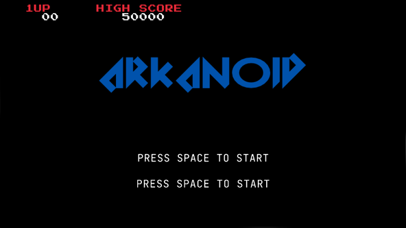

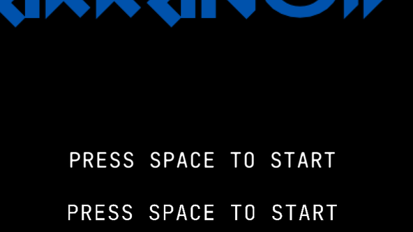
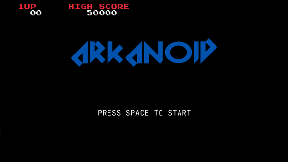
In the screen captures, the first “PRESS SPACE TO START” uses an
SDF while the second uses a regular LoadFontEx with
a TTF font. The difference is quite clear on the “A”s; the diagonal
edges are more jagged without SDF, though there is a new, albeit small, artefact
introduced at the apex using SDFs.
Why Signed Distance Fields? #
In general applications, Signed Distance Fields are a map of how far a particular point is from a shape. The SDF is just concerned with distance from a shape and includes no information on the angle or direction the shape lies in. Applying SDFs to font glyphs for a more concrete example, let’s say you are looking at a letter E. Anything touching the edge of the letter has a value of zero. Let’s now say you move away from the edge of the E, into the surrounding empty space. The SDF value now will be the distance to the closest point along the edge of the E, and has a positive value. The “signed” part comes into the equation when you consider a point inside the letter E.
The SDF font rendering technique I used originally came from a Valve paper , and is used to scale entities at high resolution, using minimal processing power. You use the GPU to draw the scaled shape or letter and decide whether a particular pixel should be shaded or not based on the SDF.
You pick a threshold, let’s say 0.5,
remember an SDF 0 value indicates you are on the
edge of the glyph, and a 1 indicates you are outside
it but close. So, you only shade when the SDF for the scaled glyph is below your
threshold.
SDF Refinements #
Surprisingly, this simple technique produces fantastic results and is cheap to compute. The paper talks about how you can tweak the algorithm when you need sharp vertices, because they might get smoothed or rounded (albeit sharply rendered).
🧑🏽🎓 Signed Distance Fields Learning Resources #
I’m still learning more of the intricacies of SDFs myself, and found the Chris Biscardi blog post and related Introduction to Signed Distance Fields Video (link opens in YouTube) quite useful.
I based my raylib implementation on the Text Font SDF code included in raylib’s examples site , and there is a link to the full code for my project further down.
Don’t forget to take a look at the Chris Green, Valve paper, mentioned above, in the previous section.
Let me know if you know of some gems on SDFs worth a read. I can update the post to include them.
🗳 Poll #
🙌🏽 raylib SDF Fonts: Wrapping Up #
In this raylib SDF fonts post, we saw a couple of ways to sharpen up font rendering in raylib. More specifically, we saw:
-
how setting
base font size with
LoadFontExcan help; - how rendering fonts at integer multiple sizes of the base font size also helps keeps the font sharper; and
- why you might consider using SDFs with raylib to render and scale fonts with curved elements.
I hope you found this useful. As promised, you can get the full project code on the Rodney Lab GitHub repo . Do let me know if you found this content useful and would like to see more similar content. Also reach out if there is anything I could improve to provide a better experience for you.
🙏🏽 raylib SDF Fonts: Feedback #
If you have found this post useful, see links below for further related content on this site. Let me know if there are any ways I can improve on it. I hope you will use the code or starter in your own projects. Be sure to share your work on X, giving me a mention, so I can see what you did. Finally, be sure to let me know ideas for other short videos you would like to see. Read on to find ways to get in touch, further below. If you have found this post useful, even though you can only afford even a tiny contribution, please consider supporting me through Buy me a Coffee.


Just dropped a blog post on using Signed Distance Fields for rendering scaled fonts sharply with raylib.
— Rodney (@askRodney) August 14, 2024
Hope you find it useful!
https://t.co/XDhGh1Gogw
Finally, feel free to share the post on your social media accounts for all your followers who will find it useful. As well as leaving a comment below, you can get in touch via @askRodney on X (previously Twitter) and also, join the #rodney Element Matrix room. Also, see further ways to get in touch with Rodney Lab. I post regularly on Game Dev as well as Rust and C++ (among other topics). Also, subscribe to the newsletter to keep up-to-date with our latest projects.