


🧑🏽🍳 What is vanilla‑extract? #
In this post, we look at how to get started using vanilla-extract with SvelteKit. Before we get going, though, we should spend a moment looking at what vanilla-extract is and why you might want to use it in your project (or at least try it out).
vanilla-extract is a modern Cascading Style Sheets (CSS) preprocessor, which generates plain CSS stylesheets. It is TypeScript friendly and leans on TypeScript to add some extra useful features. You can create your style in TypeScript files which sit alongside your Svelte code and import the styles, adding them as classes to your components. The way you use them is similar to CSS modules usage pattern.
We'll get a proper introduction shortly, but here's a sneak peek as a teaser.
Here we define some style in our index.css.ts file:
1 export const heading = style({2 fontSize: [fontSize5],3 });
then consume it in a Svelte file:
1 <script lang="ts">2 import { heading } from './index.css';3 <script>4 5 <h1 class={heading}>Example Heading</h1>
The CSS is generated at compile time, meaning there is no overhead at runtime (when the user opens up the page). Having TypeScript support allows you to create styling policies and ensure they are enforced by your team (or even by you when you return to the code in six months’ time).
We will look at an example of theming our site. In doing so, we will create a theme contract (this is quite straightforward) and just means if we decide to add a Christmas theme in a month we can be fairly comfortable it won’t break the site as long as we define the colours etc, required by the theme.
😕 How is vanilla‑extract different to vanilla CSS, Sass, Tailwind etc.? #
I first heard about vanilla-extract on the JS Party podcast. They had a show on the process Shopify used for replacing Sass . I won’t tell you what they opted for, in case you want to listen to the show! Anyway Shopify generated a grid of the pros and cons for each solution , comparing Sass, CSS, Tailwind and other frameworks. If you are looking at switching to CSS tooling, definitely consider adapting that grid to your own use case to help inform your decision process. On top, there is a top-notch GitHub discussion on replacing Sass too . Although titled “Replacing Sass”, the process was open and keeping Sass was a possible solution. Hopefully those resources answer any questions you have on the relative merits of the different solutions.
🌟 Why use vanilla‑extract for styling? #
I like vanilla-extract for a few things, probably the most important ones to me are:
- it is modern with wide support — although we focus on SvelteKit here, vanilla-extract works with ESBuild and Vite as well as Next.js and other React site generators (not Remix at the moment, though the Remix team are researching CSS modules support ),
- you create efficient CSS files with zero runtime overhead,
- contracts offer a built-in way of enforcing styles, and preventing issues like colour drift over time. This is where, for example, you might hardcode a colour in CSS, while debugging or checking contrast ratio and forget to swap it out for a variable.
🧱 What we’re Building #
We’ll knock up a minimal Single Page App advertising a couple of courses for a fictitious event. We will:
- see how to configure vanilla-extract for SvelteKit,
- create a couple of themes,
- add a contract for new themes, so they need to have all our colour variables defined.


As well as seeing the vanilla-extract features in action, we will see how to store the chosen theme in the browser local storage and a little Svelte animation. If there’s anything there you can get excited about, then let’s get started.
⚙️ Using vanilla‑extract with SvelteKit: Getting Started #
Please enable JavaScript to watch the video 📼
Create a new SvelteKit skeleton TypeScript project:
pnpm dlx sv create sveltekit-vanilla-extract && cd $_pnpm install
From the options, choose Skeleton project, Use TypeScript:? Yes, Add ESLint...? Yes and Add Prettier...? Yes. Next, we install the vanilla-extract plugins and some other packages we will use later, then start up the dev server:
pnpm install -D @vanilla-extract/css \ @vanilla-extract/css-utils @vanilla-extract/vite-plugin \ @fontsource/source-sans-pro @fontsource/source-serif-pro \ sharp vanilla-lazyload vite-imagetools \ @sveltejs/adapter-static@nextpnpm dev
We will use TypeScript in this tutorial to get the most out of vanilla-extract. We only use minimal and basic TypeScript so, hopefully you can follow along, even if you are more comfortable with JavaScript.
🔨 Using vanilla‑extract with SvelteKit: SvelteKit Setup for vanilla‑extract #
Next, we will add vanilla-extract configuration to svelte.config.js. Thanks to Ben Jervis from the vanilla-extract maintainer team for helping
to get this config working. vanilla-extract is not yet (at time of writing) a
100% ESM compatible package. Without the vite/ssr config (below) you can currently run a site in dev mode, though to build, you
will need the extra parameters. Update svelte.config.js to get started:
1 import adapter from '@sveltejs/adapter-static';2 import preprocess from 'svelte-preprocess';3 import { vanillaExtractPlugin } from '@vanilla-extract/vite-plugin';4 import { imagetools } from 'vite-imagetools';5 6 /** @type {import('@sveltejs/kit').Config} */7 const config = {8 // Consult https://github.com/sveltejs/svelte-preprocess9 // for more information about preprocessors10 preprocess: preprocess(),11 12 kit: {13 adapter: adapter(),14 vite: {15 define: {16 'process.env.VITE_BUILD_TIME': JSON.stringify(new Date().toISOString()),17 },18 plugins: [vanillaExtractPlugin(), imagetools({ force: true })],19 },20 },21 };22 23 export default config;
In line 18 we added the imagetools plugin as well as vanillaExtractPlugin().
The former is not strictly needed for running vanilla-extract though we will
use it on this site to help with processing images.
Extra setup #
For type consistency, add the Lazyload type to the browser document (this is
the src/app.t.ds in your project):
1 /// <reference types="@sveltejs/kit" />2 import type { ILazyLoadInstance } from 'vanilla-lazyload';3 4 export declare global {5 interface Document {6 lazyloadInstance: ILazyLoadInstance;7 }8 }9 10 // types for vite-imagetools imports11 export declare global {12 export module '*.jpg?w=200';13 export module '*.jpg?w=400;200&format=webp&as=srcset';14 export module '*.jpg?w=400;200&as=srcset';15 }
As a last bit of setup, download a couple of images (blake.jpg and river.jpg ) which we will use on the site. Place these in a new src/lib/assets folder. Finally, create a JSON file containing event details as src/lib/data below. Next, we will add our global vanilla-extract styles and variables.
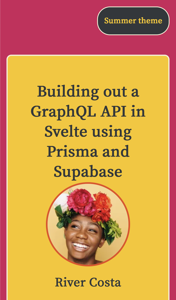
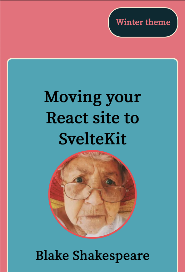
1 [2 {3 "speaker": "Blake Shakespeare",4 "title": "Moving your React site to SvelteKit",5 "date": "Friday, 6pm",6 "abstract": "Learn from my experience in transitioning my site from React to SvelteKit: what I got right, what I would do differently going forward.",7 "profileImageBase64": "data:image/jpeg;base64,/9j/2wBDAAwREhMUFBUUFBofGhUaHiIcGhohKC4jJB4hMzg/PTouKC5CRFpMPi5XRTc3VmBRVlpgZmRkQklveXFmeFtlaWf/2wBDAQgMDQwNDw8PDxFgEBIaVmBaYFpgY2NjY2BjYGBiY2NjY2NjY2NjY2NjY2JjY2NjY2NjY2NjY2NjY2NjY2NjY2P/wgARCAAKAAoDASIAAhEBAxEB/8QAFwAAAwEAAAAAAAAAAAAAAAAAAwQFBv/EABQBAQAAAAAAAAAAAAAAAAAAAAX/2gAMAwEAAhADEAAAACwt2yY//8QAHxABAAEDBAMAAAAAAAAAAAAAAQACAxMREkGBUVJi/9oACAEBAAE/AG1VgA2jUaJ9czBf9ZSGa9096TaeCf/EABkRAAEFAAAAAAAAAAAAAAAAAAEAAgMSIv/aAAgBAgEBPwBsRNtL/8QAGREAAgMBAAAAAAAAAAAAAAAAAhEAARQx/9oACAEDAQE/ANZhbXZ//9k="8 },9 {10 "speaker": "River Costa",11 "title": "Building out a GraphQL API in Svelte using Prisma and Supabase",12 "date": "Saturday, 7pm",13 "abstract": "See just how easy it can be to write an API using a modern framework and tooling. I take you through step by step from pnpm create to production ready product. The future is SvelteKit!",14 "profileImageBase64": "data:image/jpeg;base64,/9j/2wBDAAwREhMUFBUUFBofGhUaHiIcGhohKC4jJB4hMzg/PTouKC5CRFpMPi5XRTc3VmBRVlpgZmRkQklveXFmeFtlaWf/2wBDAQgMDQwNDw8PDxFgEBIaVmBaYFpgY2NjY2BjYGBiY2NjY2NjY2NjY2NjY2JjY2NjY2NjY2NjY2NjY2NjY2NjY2P/wgARCAAKAAoDASIAAhEBAxEB/8QAFQABAQAAAAAAAAAAAAAAAAAABgT/xAAVAQEBAAAAAAAAAAAAAAAAAAAFBv/aAAwDAQACEAMQAAAAoWEU8u//AP/EAB4QAAICAgIDAAAAAAAAAAAAAAECAxEABAUQIlHR/9oACAEBAAE/AN2bbSeSQNQUqqIl+S/cD2AaIvNtmHIRi/XX/8QAGBEAAgMAAAAAAAAAAAAAAAAAAAECAxL/2gAIAQIBAT8Ask3k/8QAFxEBAQEBAAAAAAAAAAAAAAAAAQIAMf/aAAgBAwEBPwBVIl4b/9k="15 }16 ]
Learn more about importing JSON in SvelteKit in the video on SvelteKit JSON data import.
🗳 Poll #
💄 Vanilla Extract Styles #
Let’s create a styles folder and add some vanilla-extract to our project
(thanks to Michael Taranto from vanilla-extract team for suggestions on
simplifying setup here). Create a new directory at src/lib.styles. In there, create vars.css.ts and styles.css.ts. These files will contain global variables and global styles for our app.
Paste in the following content:
1 import { createGlobalTheme, createVar } from '@vanilla-extract/css';2 3 export const desktopBreakpoint = createVar();4 export const lineHeightRelaxed = createVar();5 6 export const vars = createGlobalTheme(':root', {7 spacing: {8 spacingPx: '1px',9 spacing0: '0',10 spacing1: '0.25rem',11 spacing2: '0.5rem',12 spacing3: '0.75rem',13 spacing4: '1rem',14 spacing5: '1.25rem',15 spacing6: '1.5rem',16 spacing8: '2.0rem',17 spacing12: '3.0rem',18 },19 font: {20 family: {21 fontFamilyBody: 'Source Sans Pro',22 fontFamilyHeading: 'Source Serif Pro',23 },24 size: {25 fontSizeRoot: '16px',26 fontSize0: '0.8rem',27 fontSize1: '1rem',28 fontSize2: '1.25rem',29 fontSize3: '1.563rem',30 fontSize4: '1.953rem',31 fontSize5: '2.441rem',32 fontSize6: '3.052rem',33 fontSize7: '3.815rem',34 },35 weight: {36 fontWeightBold: '700',37 fontWeightBlack: '900',38 },39 },40 });
1 import { desktopBreakpoint, lineHeightRelaxed, vars } from '../styles/vars.css';2 import { globalFontFace, globalStyle } from '@vanilla-extract/css';3 4 const {5 font: {6 family: { fontFamilyBody, fontFamilyHeading },7 size: { fontSize2 },8 weight: { fontWeightBlack },9 },10 spacing: { spacing0, spacing2, spacing4 },11 } = vars;12 13 globalFontFace('HeadingFont', {14 src: 'local("Source Serif Pro")',15 });16 17 globalStyle('html, body', {18 vars: {19 [desktopBreakpoint]: '48rem',20 [lineHeightRelaxed]: '1.75',21 },22 23 fontFamily: fontFamilyBody,24 });25 26 globalStyle('body', {27 margin: [spacing0],28 });29 30 globalStyle('h1', {31 fontFamily: fontFamilyHeading,32 });33 34 globalStyle('p', {35 fontFamily: fontFamilyBody,36 });37 38 globalStyle('button', {39 cursor: 'pointer',40 padding: [spacing2, spacing4],41 fontSize: fontSize2,42 fontFamily: fontFamilyHeading,43 fontWeight: fontWeightBlack,44 lineHeight: [lineHeightRelaxed],45 borderStyle: 'none',46 borderRadius: spacing2,47 '@media': {48 '(prefers-reduced-motion: no-preference)': {49 transition: ['color', '250ms'],50 },51 '(prefers-reduced-motion: reduce)': {52 transition: ['color', '2000ms'],53 },54 },55 });
In the first file, you see how you can set up variables in vanilla-extract.
Using variables is handy when working with a design system and lets you easily
change styles across the project quickly. We have used two different methods
for setting up variables. In lines 3 & 4, we call createVar() to declare a variable. We
later give these variables values in lines 19 &
20 of the second file.
If you start getting errors about missing CSS files, check your for $lib in import paths (within .css.ts files). Swapping
them out for relative paths (../style/some-file.css.ts, instead of $lib/style/some-file.css.ts)
should set you back on the right track. Restart the dev server after making
these changes to be sure Vite is aware the files are updated.
Global Theme #
An alternative is to define the variables in the global scope (similar to what
we can do in vanilla CSS). We use a global theme to do this (lines
6 – 40 in vars.css.ts). Note we import the global
theme as vars in line 1 of src/lib/styles/styles.css, then can
destructure the values we need (lines 4 – 11). We then use
these to help set up global styles, much like you would in CSS or Sass. Next
we can see how to create a theme contract to hold variables for two colour
schemes, using local themes, rather than global themes this time.
Using vanilla‑extract with SvelteKit: Theming #
We’re only going to scratch the surface on what vanilla-extract can do
with theming here. We will create a theme template which will act as our theme contract. We then use that template to create a summer and winter colour theme.
Create a src/lib/styles/themes folder and in there
create theme.css.ts and paste the content below.
This will be our template.
1 import { createTheme } from '@vanilla-extract/css';2 3 export const [theme, themeVars] = createTheme({4 colour: {5 primary: '#f00',6 secondary: '#f00',7 alternative: '#f00',8 light: '#f00',9 dark: '#f00',10 },11 });
We are only varying colours by theme, but in a fully-fleshed out project, you might add fonts, accessible styling and a whole host of other elements. We will see in a moment when we create our actual themes, we will get a TypeScript error if we forget to define one of the theme colours. This can be great when working in teams or on long-term projects, making it harder to break the site by adding new themes.
Let’s create the summer and winter themes in the same folder:
1 import { createTheme } from '@vanilla-extract/css';2 import { themeVars } from './theme.css';3 4 export const summerTheme = createTheme(themeVars, {5 colour: {6 primary: '#d11c5b', // rubine red7 secondary: '#fac600', // mikado yellow8 alternative: '#ea4b1d', // flame9 light: '#f6eed5', // eggshell10 dark: '#32373b', // onyx11 },12 });
1 import { createTheme } from '@vanilla-extract/css';2 import { themeVars } from './theme.css';3 4 export const winterTheme = createTheme(themeVars, {5 colour: {6 primary: '#f56a79', // ultra red7 secondary: '#1aa6b7', // pacific blue8 alternative: '#ff414d', // red salsa9 light: '#f6eed5', // eggshell10 dark: '#002a32', // gunmetal11 },12 });
Try commenting out one of the lines where you define a colour in the winterTheme.css.ts file. You should get a warning in your code editor that a colour is missing.
This is one of the advantages TypeScript brings to the party. Next we will create
some components and use these themes.
🏘 Home Page Styles #
With vanilla-extract, we can define styles in a TypeScript file which sits
alongside the page or component they will be used in. Then we import them into
the Svelte file. Let’s create src/routes/index.css.ts which will contain the styles needed for the home page:
1 import { themeVars } from '../lib/styles/themes/theme.css';2 import { lineHeightRelaxed, vars } from '../lib/styles/vars.css';3 import { style } from '@vanilla-extract/css';4 import { calc } from '@vanilla-extract/css-utils';5 6 const {7 font: {8 family: { fontFamilyHeading },9 size: { fontSize2, fontSize4, fontSize5 },10 weight: { fontWeightBold },11 },12 spacing: { spacing0, spacing2, spacing4, spacing6 },13 } = vars;14 15 export const main = style({16 background: themeVars.colour.primary,17 color: themeVars.colour.dark,18 });19 20 export const heading = style({21 fontSize: [fontSize5],22 minHeight: calc(lineHeightRelaxed).multiply(fontSize4).multiply(2).toString(),23 marginBottom: [spacing0],24 textAlign: 'center',25 });26 27 export const speakerName = style({28 marginTop: [spacing4],29 marginBottom: [spacing6],30 fontSize: [fontSize4],31 fontFamily: [fontFamilyHeading],32 fontWeight: [fontWeightBold],33 });34 35 export const abstractText = style({36 borderRadius: [spacing2],37 fontSize: [fontSize2],38 lineHeight: [lineHeightRelaxed],39 minHeight: calc(lineHeightRelaxed).multiply(fontSize2).multiply(4).toString(),40 marginTop: [spacing4],41 marginBottom: [spacing6],42 padding: [spacing2, spacing4],43 backgroundColor: themeVars.colour.dark,44 color: themeVars.colour.secondary,45 });46 47 export const dateText = style({48 fontSize: [fontSize2],49 fontWeight: [fontWeightBold],50 marginBottom: [spacing4],51 });52 53 export const button = style({54 borderStyle: 'solid',55 fontSize: fontSize4,56 background: themeVars.colour.dark,57 borderColor: themeVars.colour.light,58 color: themeVars.colour.secondary,59 ':focus': {60 color: themeVars.colour.light,61 },62 ':hover': {63 color: themeVars.colour.light,64 },65 });
We see in line 1 that we import the template theme
we just created. Then throughout the file, we reference this. In our Svelte component,
we will add the class for the current theme. vanilla-extract will generate the all
the CSS we need for handling themes.
You will notice we are importing and using variables defined in our styles folder. In line 39 you can see an example of
using our existing CSS variables to calculate the minHeight for a text element.
Store #
We will use the browser local storage to keep track of which theme the user
prefers. Svelte stores will provide an interface between our components and
local storage. Make a store by creating src/lib/shared/stores/theme.ts and adding the following content:
1 import { browser } from '$app/environment';2 import { writable } from 'svelte/store';3 4 export const theme = writable<string>(5 browser ? window.localStorage.getItem('theme') || 'summer' : 'summer',6 );7 8 theme.subscribe((value) => {9 if (browser) {10 window.localStorage.setItem('theme', value);11 }12 });
In line 5 we set the default value for the store,
which is used when the page first loads. It checks if there is a value already stored
in local storage for theme and defaults to summer. The code in line 10` runs when our components update the store and sets the theme to the
value passed in.
🧩 Using vanilla‑extract with SvelteKit: Components #
Before we add the markup for the home page, we will add some components which
get used in the home page. Naturally, these components will also use
vanilla-extract, so we will continue learning on the way. Create a components
folder at src/lib/components and add Card.css.ts file with the following content:
import { themeVars } from '../styles/themes/theme.css';import { vars } from '../styles/vars.css';import { style } from '@vanilla-extract/css'; const { spacing: { spacing3, spacing4, spacing6, spacing8 },} = vars; export const container = style({ display: 'flex', width: '100%',}); export const content = style({ display: 'flex', flexDirection: 'column', alignItems: 'center', width: '60%', borderRadius: spacing3, margin: [spacing6, 'auto'], padding: [spacing4, spacing8], '@media': { '(max-width: 768px )': { width: '100%', }, }, background: themeVars.colour.secondary, borderStyle: 'solid', borderColor: themeVars.colour.light,});
Now we can create Card.svelte which will import
these styles:
1 <script lang="ts">2 import { theme } from '$lib/shared/stores/theme';3 import { summerTheme } from '$lib/styles/themes/summerTheme.css';4 import { winterTheme } from '$lib/styles/themes/winterTheme.css';5 import { container, content } from './Card.css';6 7 let { children } = $props();8 9 let themeIsSummer = $derived($theme === 'summer');10 let contentStyle = $derived(`${content} ${themeIsSummer ? summerTheme : winterTheme}`);11 </script>12 13 <section class={container}>14 <div class={contentStyle}>15 {@render children?.()}16 </div>17 </section>
This lets us see a few things. In line 9 we can
access the store with $theme (we imported the file
in line 2). All we do here is check what
the theme is. We use the store as a central source of truth, accessible in
components. This means we don’t have to pass the theme as a prop between
components. We imported styles from the Card style
file in line 5. As an example, in line 13, you add the container class variable to the
section element. vanilla-extract does the magic
to convert this to a class with a unique name and also generate the CSS.
The last interesting line here, is line 10;
where we add the right class variable depending on the current theme. We
imported the themes in lines 3 & 4.
Speaker Picture Component #
Let’s pick up the pace now and paste in a couple of files for pictures we use. We add the responsive image boilerplate in full here, though for a larger project, it is probably worth using an image component to help.
import { themeVars } from '../styles/themes/theme.css';import { vars } from '../styles/vars.css';import { style } from '@vanilla-extract/css'; const { spacing: { spacing1 },} = vars; export const image = style({ borderRadius: '50%', borderStyle: 'solid', borderWidth: spacing1, borderColor: themeVars.colour.alternative,});
<script lang="ts"> import { browser } from '$app/environment'; import { image } from '$lib/components/SpeakerPicture.css'; import { theme } from '$lib/shared/stores/theme'; import { summerTheme } from '$lib/styles/themes/summerTheme.css'; import { winterTheme } from '$lib/styles/themes/winterTheme.css'; import { onMount } from 'svelte'; let { alt, placeholder, src, srcset, srcsetWebp, }: { alt: string; placeholder: string; src: string; srcset: string; srcsetWebp: string } = $props(); onMount(() => { if (browser) { document.lazyloadInstance.update(); } }); let themeIsSummer = $derived($theme === 'summer'); let imageStyle = $derived(`${image} ${themeIsSummer ? summerTheme : winterTheme}`); const sizes = '200px;';</script> <picture> <source data-sizes="{sizes}," data-srcset={srcsetWebp} type="image/webp" width="200" height="200" /> <source data-sizes="{sizes}," data-srcset={srcset} type="image/jpeg" width="200" height="200" /> <img class={`lazy ${imageStyle}`} {alt} loading="eager" decoding="async" width="200" height="200" data-src={src} src={placeholder} /></picture>
VS Code Tip #
On a larger project, when you have a styles file for each component, it can
take you a little longer to find the files you need. To help, you can use VS
Code file nesting. This lets you tuck src/lib/components/SpeakerPicture.css.ts under src/lib/components/SpeakerPicture.svelte but reveal it with a single click. There’s a video on VS Code file nesting which goes into a bit more detail. In summary, though, you can create a local
VS Code override for this project by creating and editing .vscode/settings.json:
1 {2 "editor.formatOnSave": true,3 "explorer.fileNesting.enabled": true,4 "explorer.fileNesting.expand": false,5 "explorer.fileNesting.patterns": {6 "*.svelte": "${capture}.css.ts"7 },8 "[svelte]": {9 "editor.defaultFormatter": "svelte.svelte-vscode"10 }11 }
This config will tell VS Code to nest vanilla-extract CSS files under Svelte files with a matching name.
If anything here is missing some explanation, let me know and I can update the post.
Home Page ❤️ Svelte #
We’re back home! Replace the content in src/routes/+page.svelte:
1 <script lang="ts">2 import { browser } from '$app/environment';3 import blakeSrc from '$lib/assets/blake.jpg?w=200';4 import blakeSrcsetWebp from '$lib/assets/blake.jpg?w=400;200&format=webp&as=srcset';5 import blakeSrcset from '$lib/assets/blake.jpg?w=400;200&as=srcset';6 import riverSrc from '$lib/assets/river.jpg?w=200';7 import riverSrcsetWebp from '$lib/assets/river.jpg?w=400;200&format=webp&as=srcset';8 import riverSrcset from '$lib/assets/river.jpg?w=400;200&as=srcset';9 import Card from '$lib/components/Card.svelte';10 import SpeakerPicture from '$lib/components/SpeakerPicture.svelte';11 import talks from '$lib/data/talks.json';12 import { theme } from '$lib/shared/stores/theme';13 import '$lib/styles/styles.css';14 import { summerTheme } from '$lib/styles/themes/summerTheme.css';15 import { winterTheme } from '$lib/styles/themes/winterTheme.css';16 import '@fontsource/source-sans-pro/400.css';17 import '@fontsource/source-serif-pro/400.css';18 import { sineInOut } from 'svelte/easing';19 import { fade, fly } from 'svelte/transition';20 import { abstractText, button, dateText, heading, main, speakerName } from './index-styles.css';21 22 const sources = [blakeSrc, riverSrc];23 const sourceSets = [blakeSrcset, riverSrcset];24 const sourceSetsWebp = [blakeSrcsetWebp, riverSrcsetWebp];25 26 let currentIndex = $state(0);27 28 let themeIsSummer = $derived($theme === 'summer');29 let currentTheme = $derived(themeIsSummer ? summerTheme : winterTheme);30 let abstractTextStyle = $derived(`${abstractText} ${currentTheme}`);31 let buttonStyle = $derived(`${button} ${currentTheme}`);32 let mainStyle = $derived(`${main} ${themeIsSummer ? summerTheme : winterTheme}`);33 let alt = $derived(`Picture of ${talks[currentIndex].speaker}`);34 let placeholder = $derived(talks[currentIndex].profileImageBase64);35 let src = $derived(sources[currentIndex]);36 let srcset = $derived(sourceSets[currentIndex]);37 let srcsetWebp = $derived(sourceSetsWebp[currentIndex]);38 39 const transitionInterval = 5000;40 41 function advanceIndex() {42 currentIndex = (currentIndex + 1) % 2;43 }44 45 function startTransitions() {46 setTimeout(transitionSlides, transitionInterval);47 }48 49 function transitionSlides() {50 advanceIndex();51 startTransitions();52 }53 54 startTransitions();55 56 let flyDuration =57 browser && window.matchMedia('(prefers-reduced-motion: no-preference') ? 1000 : 2000;58 </script>59 60 <svelte:head>61 <title>SvelteKit Vanilla Extract: Course Registration Example</title>62 </svelte:head>63 {#key currentIndex}64 <main class={mainStyle} in:fly={{ duration: flyDuration, x: -100, easing: sineInOut }} out:fade>65 <Card>66 <h1 class={heading}>{talks[currentIndex].title}</h1>67 <SpeakerPicture {alt} {src} {srcset} {srcsetWebp} {placeholder} />68 <div class={speakerName}>{talks[currentIndex].speaker}</div>69 <div class={abstractTextStyle}>{talks[currentIndex].abstract}</div>70 <div class={dateText}>{talks[currentIndex].date}</div>71 <button class={buttonStyle} type="button"> Book now!</button>72 </Card>73 </main>74 {/key}
In terms of vanilla-extract, we’re not introducing new concepts here, which we haven’t seen in other components. You might notice we have added some animation. Let me know if you would like a separate post focussing on animation with SvelteKit. Svelte does make it easy to add a little polish with not too much effort. We will just gloss over some details here, so this post doesn't get too long.
In line 63 we use the key keyword to let SvelteKit know which variable change will trigger the animation.
Here, this is currentIndex which changes between
zero and one. The dynamic parts are within the Card, but we can set animation parameters in a parent element. We do that in
line 65 on the main element. There are a lot of
different easing functions you can use. Josh Nussbaum has put together a nice little playground to experiment with . You can also learn more about Svelte Transitions in the official tutorial .
🏁 Layout #
The final piece of the puzzle before testing is the layout. In our layout
component, we will add a switch for changing theme and also the related code
for updating the store. First, add the styles to a new file: src/routes/layout.css.ts.
1 import { themeVars } from '../lib/styles/themes/theme.css';2 import { vars } from '../lib/styles/vars.css';3 import { style } from '@vanilla-extract/css';4 5 const {6 spacing: { spacing12, spacing2, spacing4, spacing8 },7 } = vars;8 9 export const container = style({10 display: 'flex',11 flexDirection: 'column',12 padding: [spacing12, 'auto'],13 minHeight: '100vh',14 '@media': {15 '(max-width: 768px )': {16 padding: [spacing4],17 },18 },19 });20 21 export const header = style({22 display: 'flex',23 paddingBottom: [spacing12],24 });25 26 export const themeButton = style({27 marginLeft: 'auto',28 padding: [spacing2, spacing4],29 borderRadius: spacing8,30 background: themeVars.colour.dark,31 borderStyle: 'solid',32 borderColor: themeVars.colour.light,33 color: themeVars.colour.secondary,34 ':focus': {35 color: themeVars.colour.light,36 },37 ':hover': {38 color: themeVars.colour.light,39 },40 });41 42 export const containerMain = style({43 background: themeVars.colour.primary,44 });
Then let’s paste in the Svelte (src/routes/+layout.svelte) and have a quick look.
1 <script lang="ts">2 import { browser } from '$app/environment';3 import { theme } from '$lib/shared/stores/theme';4 import '$lib/styles/styles.css';5 import { summerTheme } from '$lib/styles/themes/summerTheme.css';6 import { winterTheme } from '$lib/styles/themes/winterTheme.css';7 import lazyload from 'vanilla-lazyload';8 import { container, containerMain, header, themeButton } from './layout-styles.css';9 10 let { children } = $props();11 12 if (browser && !document.lazyloadInstance) {13 document.lazyloadInstance = new lazyload();14 }15 16 let themeIsSummer = $derived($theme === 'summer');17 let currentTheme = $derived(themeIsSummer ? summerTheme : winterTheme);18 let buttonText = $derived(themeIsSummer ? 'Summer theme' : 'Winter theme');19 let buttonAriaLabel = $derived(20 themeIsSummer ? 'Switch to Winter theme' : 'Switch to Summer theme',21 );22 let buttonStyle = $derived(`${themeButton} ${currentTheme}`);23 </script>24 25 <div class={`${container} ${containerMain} ${currentTheme}`}>26 <header class={header}>27 <button28 aria-label={buttonAriaLabel}29 class={buttonStyle}30 onclick={() => ($theme === 'summer' ? theme.set('winter') : theme.set('summer'))}31 >{buttonText}</button32 >33 </header>34 {@render children?.()}35 </div>
The most interesting part here is in line 27.
When the user clicks the button, we change the theme in the store by calling theme.set(). This changes the theme for all components. On top, it triggers the code in
our store file which sets the theme in local storage.
💯 Using Vanilla Extract SvelteKit: Testing #
That was a lot to get through! Thanks for following through to the end. Go get a drink and some fresh air, before continuing, so you can fully appreciate testing!
Please enable JavaScript to watch the video 📼
Everything should be working now, so you can go to localhost:3000 to take the site for a spin.
Inspect one of the site's elements and see what class you find. You should see something like this:
<div class="layout__12shizy0 layout__12shizy3 summerTheme__1660gci0"> ...</div>
vanilla-extract has generated a unique class name, giving us scoped styling without the need for BEM or a similar system. Next, in your browser developer tools, open up Local Storage. You should see something like:
{ theme: "summer"}
Try toggling theme to make sure this changes. Finally, run pnpm run build then in your code editor find build/_app/assets/winterTheme.css. ... .css. This is an example of the CSS files created by vanilla-extract.
If that’s all worked, give yourself a star!
🙌🏽 Using vanilla‑extract with SvelteKit: What we Learned #
In this post, we learned:
- some vanilla-extract basics;
- configuration for using vanilla-extract with SvelteKit; and
- a cheeky peek at how to set up animation in SvelteKit.
I do hope there is at least one thing in this article which you can use in your work or a side project. There is a lot more you can learn on vanilla-extract. Continue exploring by heading over to the official vanilla-extract documentation . You can see the full working example at sveltekit-vanilla-extract.rodneylab.com/ .
As always, get in touch with feedback if I have missed a trick somewhere! You can see the full code for this using vanilla-extract with SvelteKit tutorial on the Rodney Lab Git Hub repo .
🙏🏽 Using vanilla‑extract with SvelteKit: Feedback #
Have you found the post useful? Do you have your own methods for solving this problem? Let me know your solution. Would you like to see posts on another topic instead? Get in touch with ideas for new posts. Also, if you like my writing style, get in touch if I can write some posts for your company site on a consultancy basis. Read on to find ways to get in touch, further below. If you want to support posts similar to this one and can spare a few dollars, euros or pounds, please consider supporting me through Buy me a Coffee.
Finally, feel free to share the post on your social media accounts for all your followers who will find it useful. As well as leaving a comment below, you can get in touch via @askRodney on Twitter and also askRodney on Telegram . Also, see further ways to get in touch with Rodney Lab. I post regularly on SvelteKit as well as other topics. Also, subscribe to the newsletter to keep up-to-date with our latest projects.