


This Gatsby post was written for Gatsby 3 and is no longer maintained. If you would like to try out SvelteKit or Astro, check out the maintained posts which are based on those. Astro lets you continue to use React but also with partial hydration which can be used to provide an enhanced user experience. SvelteKit offers server side rendering as well as static site generation. See the post on how performance improved switching from Gatsby to Astro for more background.
Why Accessibility is Important #
We focus on quick and easy Gatsby site accessibility gains in this post. Although we have a Gatsby focus, most of the tips can be borrowed for use with other tools. Svelte in particular, like Gatsby, has good built-in accessibility support. Why is it important to make sites as inclusive as possible? To start, one in four people in the United States has a disability. Closer to home, one in every ten people in the UK has some degree of dyslexia. If you fail to cater for this minority, you are making a decision to reduce significantly your audience. On top, many accessibility improvements provide a better user experience for all users of your website. If that alone does not get you interested, remember, user experience is key for Google. It is a key gateway to ranking on the Google search engine results page.
Why a Post on Quick & Easy Gatsby Site Accessibility Gains? #
Speaking from personal experience, it is not easy to get going on accessibility. I came to it with no experience of using assistive technology. I found advice could be contradictory. As an example, I came across pieces suggesting only serif fonts should be used in paragraphs. Then others recommending only sans-serif should be used.
Thankfully there is much information available and for the most part, it is
not so contradictory. Despite that, an element of balance is needed. Let's
consider contrast as an example. For the partially-sighted, a decent level of
contrast between text and background helps improve legibility. However, dyslexia expert Lauren Garden points out that high contrast (e.g. black
text, #000, text on a pure white, #fff, background) can trigger visual distortion for dyslexia sufferers . Clearly, we require a trade-off here. On this site, we opt for an off-white
background and near-black text on site pages with large amounts of text. We
find this compromise maximizes accessibility.
The hope for this piece on quick & easy Gatsby site accessibility gains, is not to be a definitive guide. Instead, it is something to help you dip a toe in the accessibility pool (so to speak). If you are keen to do your bit, but not sure how to start, this post should get you going on the right track.
3 Quick & Easy Gatsby Site Accessibility Gains: Tip #0 #
As this post is written for developers, let's jump in at step zero! If you are
not new to accessibility, you can probably skip this step and go straight on
to the next one. You might already know that it is important, for
accessibility, to include an alt tag on image elements.
This is so that visitors using a screen reader can get an idea of what an image
is about. Equally important, when you use decorative images, still include the alt
tag but set it to an empty string:
<img alt="" src="/assets/decorative-image.jpg" width="672" height="448"/>
Alternatively, if you're using the new Gatsby Image API:
<StaticImage alt="" src="/assets/decorative-image.jpg" layout="fixed" width="672" height="448" placeholder="dominantColor" formats={['auto', 'webp', 'avif']} />
We are creatures of habit; if you make a conscious effort to add the alt attribute to image tags, it will soon become second nature. Once you have mastered
that, move on to working aria-label attributes into
your links and making sure iframes have a title attribute. Like the alt attribute on an image,
this helps screen reader users understand the topic of the content. Remember, if
you copy iframe code from YouTube, to paste in a
title attribute:
<iframe> title="How I do an accessibility check -- A11ycasts #11" width="560" height="315" src="https://www.youtube-nocookie.com/embed/cOmehxAU_4s" frameborder="0" allow="accelerometer; autoplay; encrypted-media; gyroscope; picture-in-picture" allowfullscreen</iframe>
You can also add an aria-label on Gatsby <a /> component.
One trick I use is to put accessibility attributes first in any element. This makes it stand out whenever I forget to include one. Now we are out of the blocks, let's get on to the main three Gatsby site accessibility quick gains.
Easy Gatsby Site Accessibility Quick Gains: 💯 Ace the Lighthouse Accessibility Test #
This is probably the easiest of all the steps. In addition, it is not too much
work to get the score up to 100. There are a couple of common issues which are
quite easy to fix. Firstly, you might get a warning that the page does not
have a [lang] attribute. [lang] (language) helps assistive technology choose the best pronunciation . You can easily set the language by setting up the gatsby-plugin-html-attributes plugin. However, you might already be using the React Helmet plugin for Search Engine Optimization (SEO) . In this case, just add the following code to your existing Helmet code (to
save adding an extra plugin):
<Helmet title="Gatsby Site Accessibility: 3 Quick Gains | Rodney Lab" htmlAttributes={{ lang: 'en-GB' }}/>
Just change the code to match the correct tag for your own site's language . I have included the document title here too, which is good for Search Engine Optimization as well as accessibility.
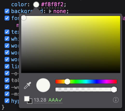
The other common Lighthouse issue is contrast ratio. Here, you should only pass the test if your text stands out from the background. As mentioned earlier, this can help partially sighted people have an easier time reading your content. Aim for a score of 4.5 or higher to meet recommended colour contrast standards . In Chrome and Firefox Developer Tools, you can tweak the colours to match the standard. Use Inspect (or Inspector for Firefox) on a text element, then go to the Style tab and find color. Just click on the colour swatch which appears. As you edit the colour, you get a live, updating contrast ratio readout.

You can run Lighthouse in Chrome or alternatively use the Google Page Speed tool . Try to get a 100 score. Lighthouse gives you “Learn More” links in the feedback, which further explain anything that is not immediately clear.
Quick Gatsby Accessibility Easy Gains: 🤖 ES Lint #
ES Lint is a tool which you can set up to scan your code for errors as you type. If you are not already using it, I would highly recommend it. It will save you a lot of time when you have a silly typo in your code. That aside, to get going on accessibility, you just have to add and set up the a11y extensions. Then, ESLint lets you know if it ever thinks your code is not in line with accessibility best practices.
There are various ways to get it up and running. I find the easiest way is to install the ESLint plugin and then to do an interactive setup. To start, jump to the project folder in the terminal and then type the following command:
npm install eslint eslint-plugin-jsx-a11y --save-dev
Then start interactive setup (make sure you have a package.json file in your project folder first):
./node_modules/.bin/eslint --init
This will create an eslint.js file (or equivalent
yml or json file depending on the options you choose) in the project directory.
Just edit this file to include the a11y options below. That completes the accessibility
part of the setup. You can tweak settings but, to get going, I would suggest you
stick with the recommended settings as below.
// .eslintrc.jsmodule.exports = { env: { browser: true, es2020: true, }, extends: ['plugin:jsx-a11y/recommended'], parserOptions: { ecmaFeatures: { jsx: true, }, ecmaVersion: 11, sourceType: 'module', }, plugins: ['react', 'jsx-a11y'],};
If you are using VS Code, install the ESLint extension by Dirk Baeumer . With ESLint integration switched on, accessibility errors in your code will be highlighted. You will probably find it a bit irritating to begin with. It is worth sticking with it and breaking through the pain barrier, though. You will quickly learn quick fixes to get rid of the red underlines.
Enduring Gatsby Site Accessibility Gains: 🏆 Accessibility Testing Tools #
Although Lighthouse reports on Accessibility, you should also run a tool focussed on testing accessibility. I recommend you pull the tests into your development continuous integration (CI) workflow. This is because, typically, you will have an initial sprint to make accessibility improvements. Once those are in the bag, you will probably turn to unrelated fixes and enhancements. Over time, without a conscious effort (and even with good intentions), you can break accessibility. If you integrate testing into your work flow, you get feedback whenever you break accessibility. This way you reduce the workload for keeping the site accessible. On top, you maintain accessibility throughout.
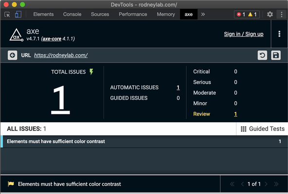
Deque have developed the axe suite of accessibility testing tools. Set up the axe Chrome browser plugin and also integrate axe Cypress testing into your development process. The Cypress-axe plugin is pretty easy to set up and Artem Sapegin has written an excellent, up-to-date post on doing this. It shouldn't take more than five minutes to set up.
Once set up, keep Cypress running as you develop. You will get accessibility errors whenever you do something to break accessibility. Using Artem's setup, you will see when there is an error in the Cypress UI. A list of errors is also printed to the terminal. It might be tricky to work out how to remedy the error, or exactly which element is causing it. This is where the axe browser extension helps. Once you have it installed, it creates a new tab in Chrome Developer Tools. From there you can trigger a test run. It gives more verbose details of errors and on top, you can have it highlight the offending elements.

If you really want a third opinion, try another Chrome Extension: the WebAIM WAVE tool . This does not have Cypress integration.
Gatsby Site Accessibility Quick Gains: 🧑🏽 Bonus #
Get feedback from site users. The automated tests are pretty good. That said, it can be difficult to know what the experience is like for real-world users without asking them. They might be able to suggest further simple changes to assist those with disabilities you had not thought of. And don't forget, typically these changes will improve the user experience for all site users.
🙏🏽 Feedback #
I hope you have found this post a useful starter on your journey to building Gatsby sites with improved accessibility. Feel free to share it on your social media accounts for all your followers who might find it useful.
Do you use a screen reader or have any accessibility requirements yourself? If you do, I am keen to hear your thoughts on the website and any improvements I could implement. Also, if anyone has more accessibility ideas or even alternatives, I would love to hear your thoughts. Tell me how you extend on what is included in this post, too. Let me know via @askRodney on Twitter or askRodney on Telegram . Alternatively, see other ways to get in touch with Rodney Lab. If you have found this post useful and can afford even a small contribution, please consider supporting me through Buy me a Coffee.
We post regularly on online privacy and security hacks, as well as Gatsby JS and website development. Subscribe to the newsletter to keep up-to-date with our latest goings-on.