


This Gatsby post was written for Gatsby 3 and is no longer maintained. If you would like to try out SvelteKit or Astro, check out the maintained posts which are based on those. Astro lets you continue to use React but also with partial hydration which can be used to provide an enhanced user experience. SvelteKit offers server side rendering as well as static site generation. See the post on how performance improved switching from Gatsby to Astro for more background.
😕 What is Scroll to Anchor? #
In this Gatsby 3 Scroll to Anchor post, we implement that feature in an MDX blog, following the simple guide step-by-step. Although scroll to anchor is a built-in HTML feature, it is not altogether obvious how to implement it in an MDX blog. With an MDX blog, you write your articles in what is basically a modified version of Markdown. This makes authoring posts quicker, compared to writing formal HTML. If you are new to MDX, by the way, this post is still for you as it is quick to pick up.
If you want to see how to implement Scroll to Anchor on a Svelte blog take a look at the SvelteKit Tutorial post. To begin with, take a look at the MDX in the starter we use below, you will see it is easy to grasp. Here, we implement the scroll-to-anchor in a new Gatsby 3 MDX blog post by just adding no more than a few lines of code.
By all means, the easiest way to see what scroll to anchor is, is to hover your mouse pointer over the heading below. You will then see a # symbol appear. Click it, and your browser will scroll to the title. By the way, also check your address bar. You will see the “hash” has been added onto the end of the page URL since clicking. This makes it so much easier for your readers to share a particular section of your blog posts. In fact, adding scroll to anchor to your blog posts is one of the best things you can do to increase engagement with your audience.
⚓️ Why use Scroll to Anchor in your Gatsby MDX Blog? #
It is nothing more complicated than this; scroll to anchor improves the user experience for your blog post readers. Your posts become more shareable as soon as you add the anchors. What's more, it's not complicated to implement.
We will only go so far as implementing the basics here. We then make sure the result is accessible. Of course, you can add more features, use Gatsby plugins or create your own with smooth scroll and the like. See Scott Spence's recent webcast on how to create a Gatsby plugin for Scroll to Anchor with bells and whistles. However, if you are looking for a quick solution to fill a 10‑minute empty window in your day, jump to the following paragraph where we code it up.
🧱 Gatsby 3 Scroll to Anchor Implementation #
Climate Gatsby 3 MDX Blog Starter #
To speed things up, we’ll use a Gatsby 3 MDX Blog starter . To begin, clone the repo from GitHub and fire up Gatsby:
gatsby new my-mdx-blog-starter https://github.com/rodneylab/gatsby-starter-climatecd my-mdx-blog-startercp .env.EXAMPLE .env.developmentcp .env.EXAMPLE .env.productiongatsby develop
Have a quick look through the folders just to get used to the setup. Once you
have a feel for it, we'll carry on. There are a few blog posts written in MDX
already in the content/blog folder. Let's look at
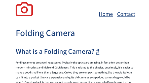
the folding-camera post. Open up the file content/blog/folding-camera/index.mdx in VS Code or whichever text editor you prefer. The top part of the file contains
front matter. This is nothing more than metadata on the post which can be used for
Search Engine Optimization (SEO) among other things. Following on, you will come
to the line below:
16 ## What is a Folding Camera?17 18 Folding cameras are a well kept secret. Typically, ...
The top line here is an h2 heading. This will be
our first candidate for adding an anchor link to. Now we know we will be doing,
let's roll our sleeves up and get to it!
Heading React Component #
A fantastic feature of MDX is the ability to use “shortcodes” in
our mark-up. These are nothing more than React components. That's exactly what
we will use here. We will create a React component to show the link shortcut.
Create a Heading.jsx file in the src/components folder and add the following code to it:
1 import React from 'react';2 import PropTypes from 'prop-types';3 4 const Heading = ({ 'aria-label': ariaLabel, children, as, hash }) => {5 if (hash === '') {6 return React.createElement(as, [], { children });7 }8 return React.createElement(9 as,10 {11 id: hash,12 },13 <span>14 {children}15 {' '}16 <a aria-describedby={hash} aria-label={ariaLabel} href={`A;#${hash}`A;}>17 #18 </a>19 </span>,20 );21 };22 23 Heading.defaultProps = {24 as: 'h1',25 hash: '',26 };27 28 Heading.propTypes = {29 'aria-label': PropTypes.string.isRequired,30 children: PropTypes.oneOfType([PropTypes.arrayOf(PropTypes.node), PropTypes.node]).isRequired,31 as: PropTypes.oneOf(['h1', 'h2', 'h3', 'h4', 'h5', 'h6']),32 hash: PropTypes.string,33 };34 35 export { Heading as default };
Here we will pass in a child element which will, eventually, be the text of
our heading. We will get a React element to be rendered out of the component.
We can specify the level of heading (h1, h2, etc.) in the as field passed in to the component.
Note that after the heading, we have an anchor element which contains the link.
As it stands, this will be displayed all the time, instead of only showing as the
mouse hovers over the title. We will fix that later.
To make the link more accessible, we have included an aria-describedby attribute. The id it mentions will be attached
to the React element we are creating.
Render our New Component #
In order to render our link, we need to include it as a shortcode in our
template. To do that end, we need to import the new component into the
template used for blog posts. This is in the file src/components/PureBlogPost.jsx:
7 import { ExternalLink, TwitterMessageLink } from './Link';8 import Heading from './Heading';9 import { PureLayout as Layout } from './Layout';10 import { PureSEO as SEO } from './SEO';
Now we have the component imported, we want to include in the shortcodes which the template provides edit the file to match this:
12 const shortcodes = {13 ExternalLink,14 Heading,15 Link,16 TwitterMessageLink,17 };
The MDXProvider component will now recognize the
Header component in our MDX file and render the
Header React component.
Now that the component is included in the template, the next step is to use
the new component in the markdown. Let's go back to content/blog/folding-camera/index.mdx and add the component for the first heading:
16 <Heading aria-label="Jump to section: What is a Medium Format Camera?" as="h2" hash="whatIsAMediumFormatCamera">What is a Medium Format Camera?</Heading>17 18 Folding cameras are a well kept secret. Typically, ..
Note the change in syntax because we now want to render a React component. Refresh your browser, and you will finally see the link appear after the heading. Also, click it and the heading should scroll to the top of the page.

Finish Up #
So far so good, but we're not done yet! Let's finish off. We want to hide the
link, while the mouse pointer isn't hovering over it. To this end, we are
going to use React hooks. Specifically, we will use the useState hook. Let's go back to src/components/Heading.jsx and edit the file to match this:
1 import React, { useState } from 'react';2 import PropTypes from 'prop-types';3 4 const Heading = ({ 'aria-label': ariaLabel, children, as, hash }) => {5 const [showLink, setShowLink] = useState(false);6 7 if (hash === '') {8 return React.createElement(as, [], { children });9 }10 return React.createElement(11 as,12 {13 id: hash,14 onMouseEnter: () => setShowLink(true),15 onMouseLeave: () => setShowLink(false),16 },17 <span>18 {children}19 {' '}20 <a aria-describedby={hash} aria-label={ariaLabel} href={`A;#${hash}`A;}>21 #22 </a>23 </span>,24 );25 };26 27 Heading.defaultProps = {28 as: 'h1',29 hash: '',30 };31 32 Heading.propTypes = {33 'aria-label': PropTypes.string.isRequired,34 children: PropTypes.oneOfType([PropTypes.arrayOf(PropTypes.node), PropTypes.node]).isRequired,35 as: PropTypes.oneOf(['h1', 'h2', 'h3', 'h4', 'h5', 'h6']),36 hash: PropTypes.string,37 };38 39 export { Heading as default };
Here we have created a showLink variable which is
tracked with useState. While the mouse hovers
over the link, showLink is set to true. Similarly, when the mouse leaves the area, it is set back to false. We are missing one thing now. You will notice the anchor link is still
always displayed. We need to add some styling and logic to hide it based on
the value of showLink.
Let's create the style first. Create a file at src/components/Heading.module.scss:
1 .hide-heading-link-visually {2 border: 0;3 clip: rect(1px, 1px, 1px, 1px);4 clip-path: inset(50%);5 height: 1px;6 margin: -1px;7 width: 1px;8 overflow: hidden;9 position: absolute !important;10 word-wrap: normal !important;11 }
The last step is to import this style module and add a class to the anchor:
1 import React, { useState } from 'react';2 import PropTypes from 'prop-types';3 import { hideHeadingLinkVisually } from './Heading.module.scss';4 // TRUNCATED...5 <span>6 {children}7 {' '}8 <a aria-describedby={hash} aria-label={ariaLabel} className={showLink ? '' : hideHeadingLinkVisually} href={`A;#${hash}`A;}>9 #10 </a>11 </span>,12 // TRUNCATED...
Basically what we are doing here is ensuring the anchor link will be announced by screen readers even when it is hidden visually. It is visually hidden whenever the mouse pointer is outside the title area.
That's it! You can go through and change the other headings to give them anchor links too.
🙏🏽 Gatsby 3 Scroll to Anchor: Feedback #
Have you found this post useful? I rather do hope it was easy enough to follow. Please let me know in any case. I would love to know your thoughts on the starter. Did it save you a bit of time by not having, firstly, to code a whole website from scratch to try out this code? Was it easy to download and start with Gatsby 3? Also get in touch if you want to see other posts in this area. If you have found this post useful and can afford even a small contribution, please consider supporting me through Buy me a Coffee.
Finally, feel free to share the post on your social media accounts for all your followers who will find it useful. You can get in touch via @askRodney on Twitter and also askRodney on Telegram . Also, see further ways to get in touch with Rodney Lab. We post regularly on online privacy and security, as well as Gatsby 3. Also, subscribe to the newsletter to keep up-to-date with our latest projects.