🤗 Accessible Images #
Creating accessible text on images on a website page is not easy. First, there are all the usual accessibility concerns when adding an image on your site. For example, you need to make sure the image has an alt text which describes the image well for partially sighted visitors. But then you need to remember to leave the alt text empty if the image is included for decorative purposes only. OK, not that difficult so far. Next, as with any other text on your site, you need to make sure that the contrast level between the text colour and the background colour is high enough.
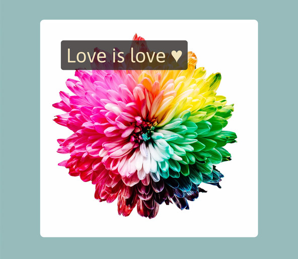
The widely accepted standard is for a 4.5 contrast ratio between the text and the background . That’s simple enough for text on a plain background… modern browsers have tools built in to help here. But what do you do when your text is overlaid on an image which had a whole range of colours? The Rainbow tool can help here . Here is an example of what we are aiming for. Although the text is a similar hue to the background, by adding an overlay background for the text with the right opacity level we can be confident the contrast ratio is in line with the standard.

What are we doing today? #
In this post, we have a look at how to add accessible text to an image and also how to ensure you follow the latest best practise to make sure the image is responsive. Although we use SvelteKit, you can easily adapt the code to work with React based frameworks or even plain HTML. If you’re keen to learn all about creating accessible text on images, let’s warm up by first taking a look at the Rainbow tool. After that, we will crack open Vim or VS Code.
🌈 What is the Rainbow Tool? #
The Rainbow Tool is nothing more than an accessibility aid for developers and UX designers. To use it you just open up the Rainbow Tool site at rainbow.rodneylab.com , add an image, customize the colours and text, hit the Get Alpha button and use the value returned in your site code. Don’t worry if you’re not sure how to add overlay text in SvelteKit. We will go over how to add text with overlay to a responsive image in a minute. First, though, let’s have a quick look under the hood.
The Rainbow tool was built using a static site generator. Its power lies in a Rust serverless function which does the maths. It works by finding the pixel (in the image) with the lowest contrast to the text colour. Then it uses a bit of High School Maths (the Newton-Raphson numerical technique) to work out the overlay transparency which satisfies the contrast ratio supplied (4.5 by default). There are a few built-in optimizations, such as resizing the image before getting going to speed up the later calculations. The code is open source, and you can view the Rainbow Site code on the Rodney Lab GitHub page . Now you know what the Rainbow tool is, shall we look at how to use it?
🔨 Accessible Text on Images How to Nail Contrast Ratio #
Please enable JavaScript to watch the video 📼
How to add accessible text to a website image #
- Open the Rainbow Accessibility tool and click Browse to add your photo.
- Next, pick your text and overlay colours. A common choice is white text on a black background, though you can be as creative as you like. If there is not enough contrast between your chosen text and overlay colours, the tool will let you know. You can also customize the text if you want to.
- Next, click or tap the Get Alpha button to fire up the Rust serverless function. After a moment, the computed alpha will be displayed. The image is updated, using this value.
-
Finally, you just head over to your favourite text editor and code up
the image. Here is example code for a responsive image. Remember to make
sure you update the alpha value for your own image.
47. Notice how we embed Next-Gen image formats , but include fallbacks for browsers which do not support them. We also make the image responsive by including different widths and specifying when each should be used.
🗳 Poll #
🙌🏽 What Are Your Thoughts? #
In this post, we looked at:
- how to use a semi-transparent overlay to make text added to an image accessible;
- using the Rainbow tool to get the opacity or alpha level; and
- how to embed a responsive image using Next-Gen formats with a fallback.
I hope you found this post useful, and you can use something from this post in one of your projects. I’m keen to hear how you have the Rainbow tool in your work. Also, it is still early in development, so I am keen to hear your suggestions on how it could be improved. You can leave a comment below, @ me on Twitter or try one of the other contact methods listed below.
🙏🏽 Accessible Text on Images: Feedback #
As I say, I hope you enjoyed the post and learned something new. I also hope you will use this code in your own projects. Be sure to share your work on Twitter, giving me a mention, so I can see what you did. Finally, be sure to let me know ideas for other posts you would like to see. Read on to find ways to get in touch, further below. If you have found this post useful, even though you can only afford even a tiny contribution, please consider supporting me through Buy me a Coffee.
Finally, feel free to share the post on your social media accounts for all your followers who will find it useful. As well as leaving a comment below, you can get in touch via @askRodney on Twitter and also askRodney on Telegram . Also, see further ways to get in touch with Rodney Lab. I post regularly on SvelteKit as well as Gatsby JS among other topics. Also, subscribe to the newsletter to keep up-to-date with our latest projects.

