


📸 Unpic, Image Hosting Services and Self‑Hosting Images #
I put together this Deno Fresh responsive images post to talk about an idea I had when I first heard about Matt Kane’s new unpic tool. The framework which first set the standard for a modern image plugin was probably Gatsby, and Matt Kane was one of the engineers that worked on their plugin. The idea behind unpic is to provide a simple API for including responsive images in your web apps. It is designed with image hosting services in mind. A kind of one tool to rule them all as there are components for Astro, React, Preact and Svelte, and each works with the popular image hosting services.
One complaint I often hear about image hosting services relates to cost. In fact, I got hit with a surprise image hosting bill for one side project I was working on. Since then, I have favoured self-hosting images for side projects. My idea was to use the convenient API which unpic provides with self-hosting. This saves you writing a lot of client code for handling responsive images. The image files can be included in the front end project or in a separate serverless API app.
Proof of Concept #
I got something working. It’s more of a proof of concept than a final working solution. Because I wanted the resizing API to be serverless and run on different hosting services, I opted for using Rust WASM for doing the image resizing heavy lifting. That is all working, though I am still looking at a solution for generating images in next-gen formats like AVIF and WebP. In this post I take you through what I have so far and some ideas for the missing part.
🧱 Imgix Image API #
I mentioned earlier that unpic supports multiple image hosting services. For using unpic it makes sense to have our own self-hosted image resizing API mimic an existing one. The Imgix Rendering API seems a popular choice and is used by Prismic, Sanity and other tools, so that is what I opted for.
In the rest of this post, I share some code from a Deno Fresh app I built as a
proof of concept. It uses a Rust WASM module for the actual resizing. We skip
over the Rust code here. Under the hood, we use the image crate for resizing, in case you are interested. You can see the Rust code in
the GitHub repo (link further down).

Client Frontend Markup #
Deno Fresh uses Preact client markup. However, there are React and Svelte plugins which use the same API and will work in exactly the same way if you prefer a different framework.
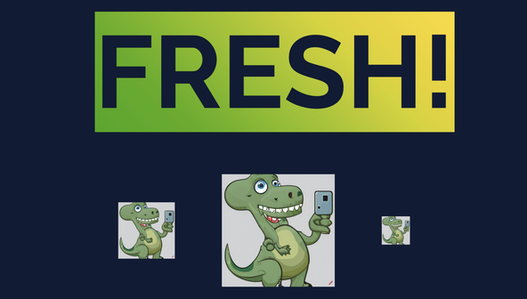
1 import { Image } from "npm:@unpic/preact";2 3 export default function Home() {4 const imageHost = "http://localhost:8000"5 return (6 <main className="wrapper">7 <h1 className="heading">FRESH!</h1>8 <section class="images">9 <Image10 src={`${imageHost}/api/images/dinosaur-selfie.png`}11 layout="constrained"12 width={128}13 height={128}14 alt="A dinosaur posing for a selfie"15 cdn="imgix"16 />17 <Image18 src={`${imageHost}/api/images/dinosaur-selfie.png`}19 loading="eager"20 layout="constrained"21 width={256}22 height={256}23 alt="A dinosaur posing for a selfie"24 cdn="imgix"25 />26 <Image27 src={`${imageHost}/api/images/dinosaur-selfie.png`}28 layout="constrained"29 width={64}30 height={64}31 alt="A dinosaur posing for a selfie"32 cdn="imgix"33 />34 </section>35 </main>36 );37 }
The most interesting parts here are:
-
We import unpic
Imagecomponent in line1. It replaces the HTMLimgin our markup. -
We will see below that
unpicmanipulates thesrcvalue. To output the correct code, I needed to use an absolute URL, even though a relative one would be fine here if we were using animgtag. -
The
srcvalue is actually an API route. Here it is available within the same project, though there is nothing stopping you from separating out the API route into its own serverless app.
🖥️ Generated Image Markup #
This is the HTML which unpic generated for the first image:
<img alt="A dinosaur posing for a selfie" loading="lazy" decoding="async" sizes="(min-width: 128px) 128px, 100vw" style=" object-fit: cover; max-width: 128px; max-height: 128px; aspect-ratio: 1; width: 100%; " srcset=" http://localhost:8000/api/images/dinosaur-selfie.png?w=128&h=128&fit=min&auto=format 128w, http://localhost:8000/api/images/dinosaur-selfie.png?w=256&h=256&fit=min&auto=format 256w " src="http://localhost:8000/api/images/dinosaur-selfie.png?w=128&h=128&fit=min&auto=format"/>
This has most lot of the attributes Addy Osmani recommends you set on your images for a good user experience. You might notice we are missing source sets for next-gen images. In fact, there is a way we can feature detect if a browser supports next-gen formats. I will get to this later!
Before we get into that, though, some important features here are:
-
aspect-ratiois set: this helps to reduce Cumulative Layout Shift -
loading="lazy": this is a good default, and Chrome, Firefox and Safari all support lazy loading now -
srcset: the responsive part which provides hints to the browser, so a mobile device should not end up wasting data downloading an image bigger than it needs
Notice these features come out of the box with unpic. You would have to
remember to include them manually if you were working with a vanilla img tag.
Image Resize API Route #
The generated image source URLs follow this pattern:
http://localhost:8000/api/images/dinosaur-selfie.png?w=256&h=256&fit=min&auto=format
The pathname includes a filename for the image we need. Then the URL search
parameters provide the width and height values which you would expect. As well
as those, we have fit=min a scaling/resizing parameter.
Finally, auto=format indicates the API should use
content negotiation to determine the most suitable image format (returning a next-gen format when
supported).
Using Deno Fresh, we can create a template API route. This will listen on the
routes matching http://localhost:8000/api/images/[FILENAME]. Astro, Remix and SvelteKit have mechanisms for handling template
parameters. With Deno Fresh, we can create a handler file at routes/api/images/[file].ts to listen on these routes.
import { HandlerContext } from "$fresh/server.ts"; export const handler = async ( request: Request, context: HandlerContext): Promise<Response> => { if (request.method === "GET") { const { params: { file }, } = context; const { url } = request; const { searchParams } = new URL(url); const width = searchParams.get("w"); const height = searchParams.get("h"); const fit = searchParams.get("fit"); // TRUNCATED... }}
Here we are just reading the image parameters from the request URL.
Finding the Requested Image #
Next, we can map the request pathname to an image file within the project.
Since the file parameter in the pathname can be arbitrary, it is important to
check there is actually a matching file within the project and to return a 404 error where there is not one.
// ...TRUNCATED let image_bytes: Uint8Array | null = null; try { image_bytes = await Deno.readFile(`./images/${file}`); } catch (error: unknown) { if (error instanceof Deno.errors.NotFound) { return new Response("Not found", { status: 404, }); } } // TRUNCATED...
Deno Fresh Responsive Images: Resizing #
The resizing is done with WASM code. The JavaScript sharp library is an alternative here, though I decided to use WASM, so the code could be deployed in more environments. sharp is based on the libvips C library and there is a related wasm-vips project. wasm-vips is still in the early stages of development though.
import { instantiate, resize_image } from "@/lib/rs_lib.generated.js"; export const handler = async ( request: Request, context: HandlerContext): Promise<Response> => { // TRUNCATED... await instantiate(); const resizeOptions = { width: Number.parseInt(width), height: Number.parseInt(height), ...(typeof fit === "string" ? { fit } : {}), }; const { error, resized_image_bytes: resizedImageBytes, mime_type: mimeType, } = resize_image(image_bytes, resizeOptions);// TRUNCATED... }
The import in the first line is where we make the WASM module accessible to the handler.
Deno Fresh Responsive Images: Response #
Finally, we can return the image with caching headers. When returning a 404 error, set the headers not to cache, just in case there is a temporary issue.
return new Response(new Uint8Array(resizedImageBytes), { headers: { "Content-Type": mimeType, "Cache-Control": "public, max-age=31536000, immutable", },});
🦀 Rust WASM Module #
The wasmbuild Deno module makes creating WASM code
in Deno fairly straightforward. It is a wrapper for wasm-pack and you can just use that directly if not working in Deno. In Deno however, just
add wasmbuild to your deno.json:
1 {2 "lock": false,3 "tasks": {4 "check": "deno fmt --check && deno lint && deno check **/*.ts && deno check **/*.tsx",5 "start": "deno run -A --watch=static/,routes/ dev.ts",6 "build": "deno run -A dev.ts build",7 "preview": "deno run -A main.ts",9 "update": "deno run -A -r https://fresh.deno.dev/update ."10 },11 "lint": {12 "rules": {13 "tags": [14 "fresh",15 "recommended"16 ]17 }18 },19 "exclude": [20 "**/_fresh/*"21 ],22 "imports": {24 "@/": "./",29 },30 "compilerOptions": {31 "jsx": "react-jsx",32 "jsxImportSource": "preact"33 }34 }
Then initialize the project and once your Rust code is ready, build the WASM module:
deno task wasmbuild newdeno task wasmbuild
🐘 Deno Fresh Responsive Images: What is Missing? #
I mentioned earlier that there is no next-gen image generation here yet. We
can implement our own form of content negotiation by inspecting the Accept header on the request:
import { instantiate, resize_image } from "@/lib/rs_lib.generated.js";export const handler = async ( request: Request, context: HandlerContext): Promise<Response> => { const { headers } = request; console.log(headers.get("Accept")); // TRUNCATED...}
A typical header value here would be:
"image/avif,image/webp,*/*"
That is for the current version of Firefox, letting us know we can send AVIF or WebP images in this case. We can then request the preferred format from the WASM module, so it churns out a next-gen image when supported.
What is missing is the WASM code to output the next-gen image. For WebP there
are a few Rust implementations which port the C libwep implementation.
Similarly, for AVIF, you can find ports of the C rav1e library. These are not
ideal for writing WASM modules in Rust, and pure Rust implementations are
favoured. For AVIF, the ravif library is a potential
pure Rust option. I still need to do some feasibility work here.
🗳 Poll #
🙌🏽 Deno Fresh Responsive Images Wrapping Up #
We saw some thoughts on working with Deno Fresh responsive images in Deno. In particular, you saw:
-
how you can generate responsive image markup using
unpic; - how you might implement content negotiation for delivering the optimal image; and
- the building blocks for an approach to a self-hosted image API
The complete code for this project (including Rust source) is in the Rodney Lab GitHub repo . I do hope the post has either helped you in an existing project or provided some inspiration for a new project.
Get in touch if you have some questions about this content or suggestions for improvements. You can add a comment below if you prefer. Also, reach out with ideas for fresh content on Deno or other topics!
🏁 Deno Fresh Responsive Images: Summary #
Is there a Deno Fresh image plugin? #
- At the time of writing, there is no image plugin for Deno Fresh. That said, the unpic plugin, although not written specifically for Deno Fresh, can do a lot of heavy lifting. We have seen there is a Preact package for the plugin which will be useful when you host your images with a service. We also saw you can use it to save you writing boilerplate code when self-hosting images.
Does unpic only work with image hosting services? #
- unpic is image tooling designed to make adding responsive images to your web apps easier when working with an image hosting service. The plugin just generates an img tag with image source URLs in a format compatible with an image hosting service API (like Imgix). You can create your own self-hosted API which mirrors the Imgix API URLs, for example. This can be convenient for spinning up a quick side-project or proof-of-concept, as well as offer cost savings.
How does content negotiation work for serving next-gen images? #
- Image formats like AVIF and WebP promise equivalent image quality to JPEG or PNG, but with smaller files. They are fantastic for improving user experience. However, older browser versions do not support them. Content negotiation lets you determine which formats a particular user browser supports and from those provided to serve the optimal one. In the code for an image route handler, you can look for the `Accept` request header. This might look something like `image/avif,image/webp,*/*`. In that case, the browser is signalling is supports AVIF. As this is the newest and most efficient format, we can respond with an AVIF image, remembering to set the response Content-Type header to `image/avif`.
🙏🏽 Deno Fresh Responsive Images: Feedback #
Have you found the post useful? Would you prefer to see posts on another topic instead? Get in touch with ideas for new posts. Also, if you like my writing style, get in touch if I can write some posts for your company site on a consultancy basis. Read on to find ways to get in touch, further below. If you want to support posts similar to this one and can spare a few dollars, euros or pounds, then please consider supporting me through Buy me a Coffee.


Just dropped a post on how you can use unpic to power your own self-hosted image API with resizing.
— Rodney (@askRodney) March 10, 2023
Hope you find it useful!
#unpicturethishttps://t.co/BpRMKmH73M pic.twitter.com/2i2mSYUhAo
Finally, feel free to share the post on your social media accounts for all your followers who will find it useful. As well as leaving a comment below, you can get in touch via @askRodney on Twitter, @[email protected] on Mastodon and also the #rodney Element Matrix room. Also, see further ways to get in touch with Rodney Lab. I post regularly on Astro as well as Deno. Also, subscribe to the newsletter to keep up-to-date with our latest projects.